I build Audibase. It sells AI music to people who actually play it out, and it already had a website, a phone app on both platforms, and CarPlay. This week I gave it a television, and the television was the one that argued back.
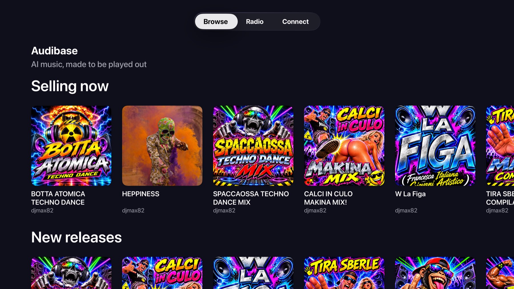
I shipped the Android TV build as the smart TV web app in a wrapper, which took an afternoon. I could not do that here, because tvOS has no WebView at all. So I wrote it native in SwiftUI, and I am glad I had to: it meant I had to make every decision again instead of inheriting it.
The remote is the design brief
On a phone you point at what you want. On a television you walk to it, and something decides where each press of a direction puts you. That something is Apple's focus engine, and it is doing geometry. It is not reading your intent, and it is certainly not reading mine.
My first real fight with it: pressing down off a card in the top row landed somewhere in the middle of the row below. I spaced the rows tighter, the next shelf came into view, and on the 1080 simulator it behaved. I called it fixed. Then I ran it on an actual television and it still landed in the middle.
I had not fixed it. I had moved the geometry just far enough that the simulator stopped showing me the bug.
So I stopped hoping and made the shelf state the rule instead. A card only goes from unfocused to focused when focus arrives from outside the row, because walking along a row never lets go of it. When that happens anywhere but the first card, I put focus back at the start.
I found another one the same week: pressing up off the radio tiles landed in the sidebar and stuck there. The sidebar sits at the left edge, the tab bar sits in the middle, they never overlap, and the focus engine had nowhere to go. I now hand focus back to the page, and the tabs are one press above that.
Nobody can sign in on a television
You cannot drive Google or Apple sign in from a remote. For a while I shipped it with no account at all, reading the public catalogue. That was honest, and it was useless the moment anybody wanted to hear something they had bought.
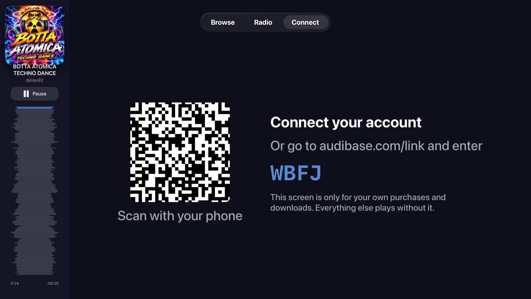
So the set asks my API for a pairing, shows the code with a QR of the same link, and polls. You approve it on a phone you are already signed in on, and the next poll comes back with tokens.
The thing I had to get right is that the code is not the secret. It is on a screen anybody in the room can read. The secret is a second value that never leaves the app, and that is what turns an approval into tokens. Once I had that straight I could shorten the code from eight characters to four: four out of thirty one is about a million combinations against the handful alive at any moment, each good for ten minutes, approved once, and rate limited.
I also made the screen say what it is for, which mattered more than I expected. "This screen is only for your own purchases and downloads. Everything else plays without it." I did not want anybody thinking they had hit a wall.
A sofa is not a phone
My first version showed a connected viewer their releases and their purchases. That is where I keep my things, as the person who sells on it. It is not where a listener keeps theirs, and it took somebody using it for me to see that.
They get the same four shelves in the same order as their profile on the website now: media, playlists, releases, albums. I deliberately left out software, events, groups and TV shows, because none of them is something you put on from a sofa.
Two of those four are not what they look like. Media and releases carry their own stream and play on Select. A playlist or an album is a list of ids with no stream on it, so Select has to fetch the contents, start the first and queue the rest. I also made a container card say how many tracks are in it, because four identical dark squares under a heading is not a shelf anybody can use.
Checking those endpoints against production with a real token turned up a bug I had been carrying for months. My playlist media route read its owner from `userId`, a flat field I replaced with `ownerId` in the schema long ago, so every track written since came back with an owner missing its id. The route's own OpenAPI schema says that id is required, so anything decoding strictly got nothing. On the television that was a playlist that silently refused to open. The code looked fine to me. Decoding the live response against the real models is what caught it.
The waveform is the scrubber
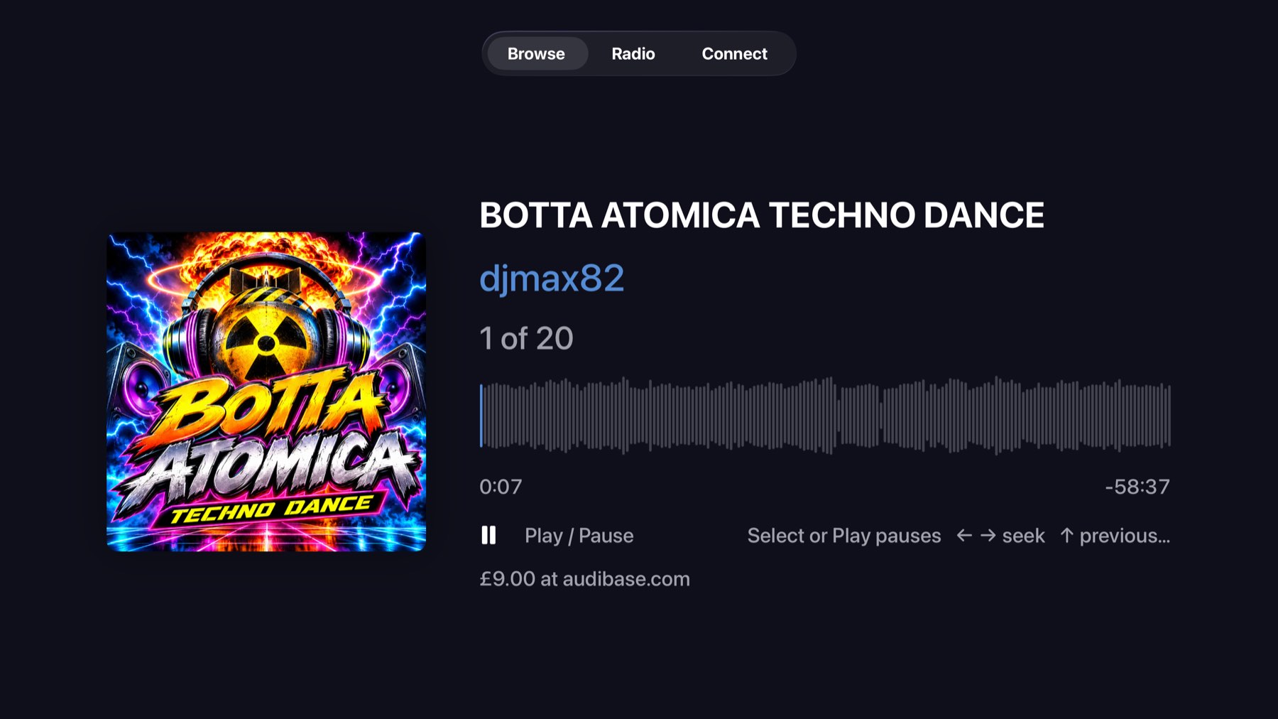
I hold the player to the same written rules as my other four clients. Previous restarts the track over three seconds in and steps back under it. The queue is one list with a cursor. Repeat is three way. Shuffle restores the order it took rather than reshuffling back.
The sidebar waveform had two faults, and I had already announced one of them as fixed. I was asking for 44 lines across six hundred points, which is a fat lozenge every fourteen points, and my earlier fix edited a line that did not match anything, so nothing changed and I said it had. Underneath it was a worse one I had not seen at all: if a track's waveform file held fewer points than I asked for bars, my code returned the peaks unchanged and ignored the count entirely, so a fifty point waveform drew fifty fat bars no matter what I requested.
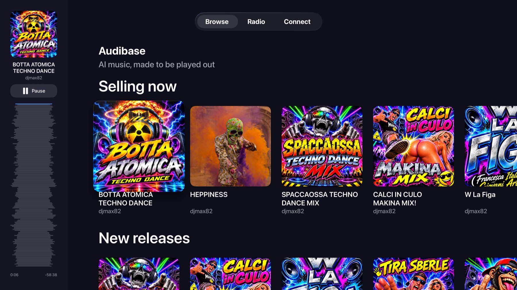
That sidebar is also where I corrected something I got plainly wrong. I had choosing a single track open the full player over whatever you were doing. Now it just starts, the sidebar picks it up, and you carry on browsing. I only open the full screen for a queue worth looking at, a playlist, an album or a station, or when you press the artwork.
Radio
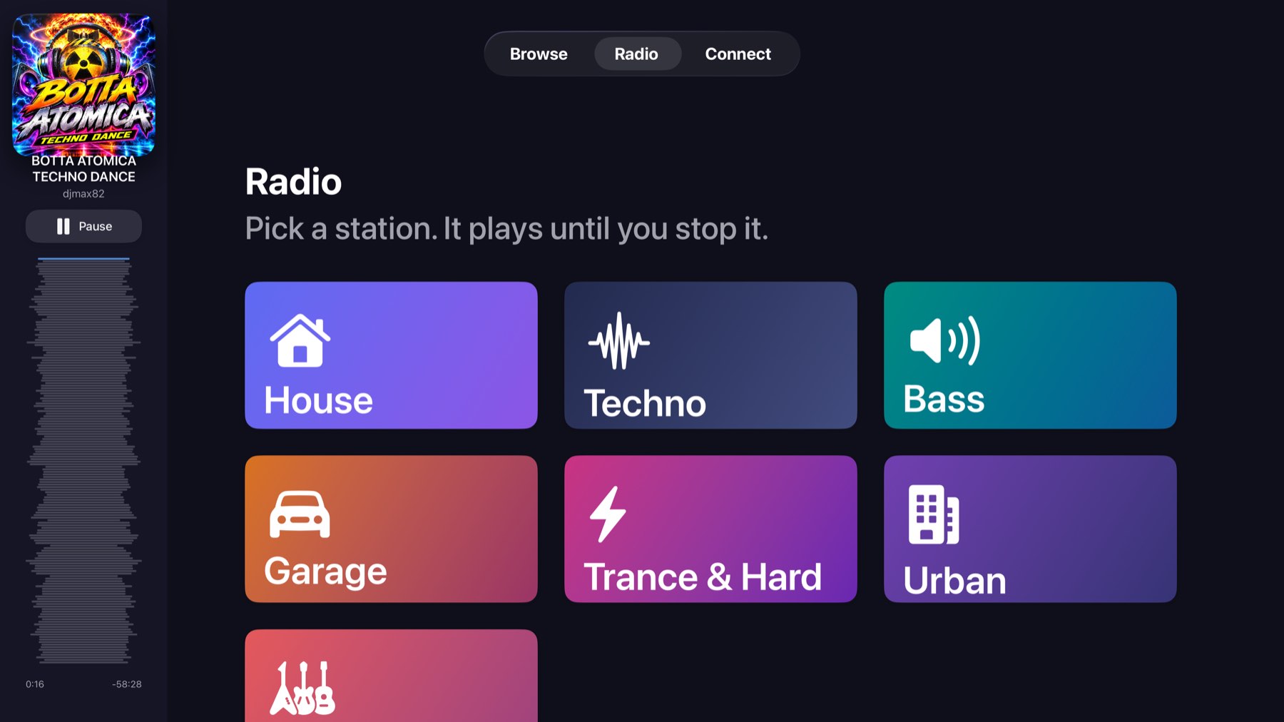
I kept stations as genre tiles, and pressing one plays immediately rather than opening a list, which is the same rule I follow in CarPlay. I have one watcher running for the life of the app that tops the station up when fewer than three tracks are waiting, so it keeps going while you are off browsing.
Tests, because a build says nothing
A television compiles exactly as happily when every card on it is a dead button. I have no Simulator app here that will press a remote for me, so I wrote two UI tests that drive the real app against the live catalogue. One browses and plays, and asserts the clock moves rather than that a screen appeared. The other tunes a station in.
They caught three faults I could not have found by building. `fullScreenCover` does not present inside a TabView page on tvOS, so my track played and no screen appeared, and both screens push instead. Without `focusSection()` on a shelf, focus never enters the row and every card reads as dead. And a cold launch holds focus on the tab bar for two presses, which is the platform rather than me, so I wrote that into the test instead of pretending otherwise.
I take the App Store screenshots with the same machinery: a test drives the real app against the real catalogue and photographs it. Every picture in this post is one of those. I have not mocked up anything.
Seeing it run
It is with Apple now. The feature list is short and was never the interesting part. What I took from it is that one input and no keyboard removes every escape route a phone gives you, and whatever is left has to be right.